Thank you everyone for all the information.
Thank you Paul for sharing your experience. This is exactly what I was asking about and I appreciate you providing me with a search term, 'catalytic fade', to get me started learning some more. I respect your opinion in these matters and even though you are careful to establish that your conclusion may not be founded, I regard even your suspicion as significant.
Thank you, Ernst and tboleyyh, for your feedback regarding colour artefacts when mixing coloured inks to make BW prints. I was really asking about the problems that might occur when mixing inks outside the printer, which largely remain an unknown. But, of course, I am very interested and appreciative of your feedback regarding the use of colour inks for BW printing. In regard to metameric failure and achieving a neutral (enough) print tone, these are things I can experiment with, even with the inks in the default configuration. Paul has suggested that as little as one third K load is sufficient to minimise the colour artefacts for a range of lighting conditions. I find a pretty large range of tones attractive so maybe I can trade 'neutral' for an easier 'pretty'. When I have a functioning printer working again I look forward to experimenting. Perhaps I will end up just using the K in the end.
As for the unknown fade properties of the various colourants that will cause the tone of the print to change over time, Aardenburg fade test results might give some clues. They seem to indicate that while grey patches printed by mixing the coloured inks fade toward blue, those printed using just the K tend toward brown relatively quickly (although by Aardenburg's Conservation Display ratings the K ink alone still scores better). Maybe the two could compliment one another. The best choice, by far, seems to be a good lacquer though.
Paul, you have mentioned in the past that the diluted K exhibited poor fade resistance. Out of curiosity, can I ask if this was significantly worse than a print using just undiluted K (allowing for some neutralising colour)?
Thanks again. If I find the time I'll post with my own experiences, but I probably won't mix a grey outside of the printer until I hear of somebody who has had great success trying it first.
Message
Re: [Digital BW] Re: Is it possible to mix Claria colour inks to make a neutral grey ink?
2015-10-08 by Paul Roark
I never tested diluted Noritsu K against the un-diluted. I assumed dilution can't help the problem.
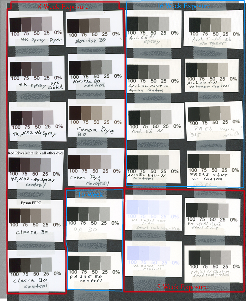
The relative color changes -- based on http://www.aardenburg-imaging.com/ testing -- of the black ink v. the colors is shown at page 3 of http://www.paulroark.com/BW-Info/4000-Noritsu-2K.pdf . My fade test of the two approaches, which is generally consistent with the above information, is posted at http://www.paulroark.com/BW-Info/2nd-8wk-Fade-test-7-26-2015.jpg in the form of a scan of all the test strips and their control (dark storage) strips. The "4K, NK2-No spray" v. the "Noritsu BO" pairs was the main comparison I was interested in. While they don't look much different, the measures of the test patch changes is roughly consistent with the predictions. In particular, Lab B moves down when the dominant inks are the color inks, versus up with the black only. Note that the fade test is roughly equivalent to 50 Mlux-hours of Aai&A or 25 Wilhelm years of display. (See http://www.paulroark.com/BW-Info/Fade-Test-Claria-Roark-v-AaIA-7-2015.pdf)
While with old wet lab color materials the degree of fade we see with these dyes might be considered OK, I don't consider the dyes up to "fine art" B&W standards. (I will be hanging carbon prints under Tru-Vue Museum glass at Gallery Los Olivos on Monday.) The dyes are great for cards and medium term display. The technology also allowed me to mount a very nice show without the cost of mats and glazing, and without the reflections of plain glass or acrylic. Although the dyes don't do very well under fluorescent lights, they generally make a very impressive display.
I used just the diluted K with some LM for a long time making B&W cards, and I never saw any noticeable change in the cards, including some that were intentionally left out on the mantle for over a year. So, I think the dyes have very appropriate uses, but carbon remains the fine art, archival champ by a very large margin.
Paul
On Thu, Oct 8, 2015 at 1:11 AM, nigglefish@... [DigitalBlackandWhiteThePrint] <DigitalBlackandWhiteThePrint@yahoogroups.com> wrote:
Attachments
- No local attachments were found for this message.