2016-02-05 by roark.paul@...
This inkset is for the 1400/1430 etc. family of printers, though the concepts apply to all of the Eboni variable tone inksets I've set up in recent years.
The PDF for this inkset -- http://www.paulroark.com/BW-Info/Eboni-Variable-Tone.pdf -- has been updated just to note that the product numbers for the Canon inks used to make the toner changed. What was originally 105B was changed to 106B, actually some time ago. I have the new numbers and links to purchase sources in this and the other EbVT PDFs.
The Profiles Zip file for the inkset was updated with everything I have in my folder that relates to the inkset. In particular, I made a "generic neutral" profile that should work with most (matte inkjet) papers as long as the K ink limit is set (print the 21-step test file with the K-0-100 profile) and the profile is linearized. I split the dilute gray inks into 2 channels -- gray and toner. Profiles I make that use this approach usually have a "T" in the names.
While the generic profile is a "neutral" one, it makes the most sense to make one with the blue toner in it, and also make a second one with the blue toner turned off ("not used"), renaming the profile as a carbon profile. Then use the QTR sliders to control intermediate print hues and split toning.
My continued use of this basic EbVT inkset approach in all of my carbon (serious) printers reflects the fact that, for me, this is the best compromise of flexibility, lightfastness, simplicity, and economy. It's too bad MIS has not picked up the ball on the toners.
Paul
PaulRoark.com -- Paul Roark's Photographic Home
2016-02-06 by mccarvill@...
Thanks, Paul. As you know, I like my glossy prints, but between
this PDF and seeing examples of your work you make it very tempting to experiment
with matte!
2016-02-06 by Paul Roark
I noted the post on the QTR forum about the difficulty of coordinating the tones with the OEM LC and LM. It's tough for most. The single toner that has the Lab A fixed by the blend ratio is an order of magnitude easier and a very good solution for dedicated B&W and fine manual control.
(At the moment, however, the "Eboni" carbon plus Epson matte canvas natural coming off my 9800 is too good to allow me to be distracted by a glossy substrate.)
Paul
Show quoted textHide quoted text
On Fri, Feb 5, 2016 at 8:51 PM,
mccarvill@... [DigitalBlackandWhiteThePrint]
<DigitalBlackandWhiteThePrint@yahoogroups.com> wrote:
Thanks, Paul. As you know, I like my glossy prints, but between
this PDF and seeing examples of your work you make it very tempting to experiment
with matte!
2016-02-09 by rdeloe1@...
I’ve adapted Paul’s “generic” curves for two papers: Premier Art Smooth Bright White 200 gsm and Premier Art Fine Art 205 gsm. My other favourite paper is Premier Art Smooth Fine Art 325 gsm; it’s next. It was easy to create neutral and warm curves that work very well alone or in combination for the two papers I’ve set up so far. I’m actually amazed at how well they work, and how much better my prints are looking.
For those who are interested in trying Paul’s curves out, here are some notes on my experiences, and why I’m currently using them rather than profiling from scratch.
I’m using an Epson Artisan 1430 with Quadtone RIP, and I mixed my “Eboni Variable Tone” ink from scratch using Paul’s formula and Eboni 1.1. Note that for the blue toner in the Y position I used a 75% clear base and 25% blue mix instead of 90% clear base and 10% blue mix. This required changing the Ink Limit for Y from 30 to 12 in Paul’s generic curves (which are designed for a 90% base in the case of the 1430). For each curve and paper, I linearized independently using a spectro.
Importantly, I use Lightroom in a color-managed Windows environment, and I don’t have Photoshop. See the end of this post for why that matters if you’re in the same position.
I made “neutral” and “warm” versions for both papers. The warm version is based directly on the neutral curve, with the only difference being that Y (the blue tone) is not used and the curve was re-linearized.
I experimented quite a bit with the limits and densities, but in the end the curves supplied by Paul worked best for me with their original parameters (except for Y, as above) and of course linearization. As a side note, Paul’s generic curves seem to be very robust; in my testing, they responded to changes in limits and densities, but never “broke”. This may explain why they work so well for me “out of the box” on the papers I’m using.
I now have excellent neutral and warm curves that, when used together with QTR’s sliders let me adjust for the exact tone I’m looking for in a print. Split toning also works very well, especially because the curves are identical except for the Y ink and slight differences from linearization.
It’s fair to ask “why not make a curve from scratch for each paper”. If you have the skills and the equipment, then that’s a great option. I have the equipment and my skills are getting better… but the learning curve is mighty steep! For people who want to focus on printing photographs, rather than diving deep into QTR profiling, curves like this are a great solution. If you can figure out how to linearize, you’ll be up and running in short order. It’s not quite a turnkey solution, but it’s a lot simpler than starting from scratch with each paper and ink.
Technical note for Windows Lightroom Users
--------------------------------------------------------------
I wasted a lot of time adjusting limits and densities on Paul’s curves because my prints were coming out flat and dull. I thought the curves were the problem. The issue actually was the way I was generating the TIFF files. In a Windows environment, using Lightroom, you have to export a TIFF image that you then print using QTR. I was exporting my TIFFs with the Adobe 1998 color space, which is a curved space. QTR uses a straight-line colour space. For Photoshop users, it’s easy to deal with this: apply Paul’s GG22-to-QTR.acv curve to a TIFF file created for printing with QTR and you’re good to go. I don’t have or use Photoshop, so I need a Windows Lightroom solution.
I posted in the QTR forum explaining the issue and how I deal with it now (but my solution still feels kludgy so my post is seeking advice!) If you have a good Windows Lightroom solution, please consider responding to that posting so that others in this situation can follow.
https://groups.yahoo.com/neo/groups/QuadtoneRIP/conversations/messages/13420
2016-02-09 by paulmwhiting@...
rdeloe1,
Allow me to ramble a bit!
I've been following Paul's posts on this new inkset and was interested in your use of it. I have a 1400 and have been using Paul's original (without the cooling toner) inkset with good success. In the darkroom I was using Ilford's MG paper because of its whiteness - but now I've come to prefer the warmer Eboni mix. Lately my prints for some reason have become flat and dull, as you experienced. I also use PremierArt Fine Art 205 which is very slightly warmer also since it has no OBAs. I had forgotten about that GG22-to-QTR.acv curve - thanks for mentioning that. I used to use it but had gotten away from it for some reason. I was using it more when I had an 1800 printer and printed with 3 carts of Eboni, no diluted carts.
I'm not clear on one thing: when you use your "warm" version curve, I see that you simply don't use the Y channel. So then you're printing with just the remaining five cartridges? Do you also have to go back to the original Ink Limit for Y?
Also: in your "neutral" inkset, do you use just the blue and no cyan? (I just checked the price on those Canon carts at Atlex... $75 each!)
I'm finishing up my pint of Eboni 1.0 so I'll wait till that runs out before I dip into this new inkset.
I hope my questions were clear... I'm on a learning curve too!
Thank you,
Paul W.
2016-02-10 by rdeloe1@...
Hopefully Paul R will jump in and offer corrections if I get this wrong (I'm also on the learning curve).
The "warm" curve is simply the "neutral" curve with the Y position set to "Not Used", and then re-linearized. With Eboni 1.1, Paul has determined that Y isn't needed anymore (which makes space for the blue toner in the "neutral" curve). I've printed with only the warm curve, and it's a like a slightly warmer version of 6 position Eboni 1.0 (i.e., with the 2% dilution Y position) -- but it's just a bit warmer.
You need the C and the B Canon Lucia inks. I confess I was so excited to try this approach that I bought both -- at $150... I now have a very large supply of toner base to use up! I hope it lasts a good long time. I'm glad you raised this though: I was wondering if the same ink is used in smaller Canon tanks or cartridges. That might be both more economical and less wasteful.
2016-02-11 by paulmwhiting@...
Thanks, rdeloe, for the clarification,
Interesting to learn that the Y is no longer needed. Upon studying the pdf more carefully, I see where he pointed that out, I apparently missed that.
But... if the Y position is not used, do we need to worry about that nozzle clogging from dis-use?
I really should not worry about a lot of this till I use up my Ebon 1.0 and start with 1.1. It was helpful to read your posts, I think we're at about the same point on the learning curve - but I think you're a bit ahead of me!
Regards,
Paul
2016-02-11 by Paul Roark
Paul W.,
Always run some ink in every position. My point about the Eb6-Y was that, particularly in a 1.5 pl printer (very small droplets), a 2% Eboni MK, 98% clear base is way more dilute than needed. So, for that plus other reasons (like control with the Epson driver) the Y position is the best place for a cool toner.
Another reason I';m tending to not use the 2%/98% dilution is that with Eboni v. 1.1, it';s not more neutral. With the original Eboni, on a number of papers, the Eb6-Y was more neutral than the middle-dilutions.
I'm surprised you're finding the Eb6 prints not warm enough now. Didn't you print with the 1800 3MK setup for years? Eboni MK by itself makes by far the most neutral 100% carbon prints.
If you want to go warmer and never want to go more neutral, you could use the Y position for a warm toner. Someone I communicated with lately was going to use Epson Yellow there. Frankly, like the cool toner, I never found a single-ink toner that I thought had the right color to be a toner. That is why I mixed the sepia toner with M and Y pigments for one of MIS';s older inksets. If you're interested in a warm toner, I'll dig out the formula for the sepia toner I thought did the best job with regard to print tone. (If it were just me, I'd use Canon or HP pigs, however. My sepia toned prints are fading noticeably.)
Paul
Show quoted textHide quoted text
On Wed, Feb 10, 2016 at 5:22 PM,
paulmwhiting@... [DigitalBlackandWhiteThePrint]
<DigitalBlackandWhiteThePrint@yahoogroups.com> wrote:
Thanks, rdeloe, for the clarification,
Interesting to learn that the Y is no longer needed. Upon studying the pdf more carefully, I see where he pointed that out, I apparently missed that.
But... if the Y position is not used, do we need to worry about that nozzle clogging from dis-use?
I really should not worry about a lot of this till I use up my Ebon 1.0 and start with 1.1. It was helpful to read your posts, I think we're at about the same point on the learning curve - but I think you're a bit ahead of me!
Regards,
Paul
2016-02-11 by Paul Roark
Show quoted textHide quoted text
On Wed, Feb 10, 2016 at 8:06 PM, Paul Roark
<roark.paul@...> wrote:
Paul W.,
Always run some ink in every position. My point about the Eb6-Y was that, particularly in a 1.5 pl printer (very small droplets), a 2% Eboni MK, 98% clear base is way more dilute than needed. So, for that plus other reasons (like control with the Epson driver) the Y position is the best place for a cool toner.
Another reason I'm tending to not use the 2%/98% dilution is that with Eboni v. 1.1, it's not more neutral. With the original Eboni, on a number of papers, the Eb6-Y was more neutral than the middle-dilutions.
I'm surprised you're finding the Eb6 prints not warm enough now. Didn't you print with the 1800 3MK setup for years? Eboni MK by itself makes by far the most neutral 100% carbon prints.
If you want to go warmer and never want to go more neutral, you could use the Y position for a warm toner. Someone I communicated with lately was going to use Epson Yellow there. Frankly, like the cool toner, I never found a single-ink toner that I thought had the right color to be a toner. That is why I mixed the sepia toner with M and Y pigments for one of MIS's older inksets. If you're interested in a warm toner, I'll dig out the formula for the sepia toner I thought did the best job with regard to print tone. (If it were just me, I'd use Canon or HP pigs, however. My sepia toned prints are fading noticeably.)
Paul
2016-02-11 by paulmwhiting@...
Paul R.,
Maybe I misunderstood rdeloe, but it sounded like he was tagging the Y position as "not used" when he wanted a warmer print.
I don't know what has happened to my setup either. Yes, I did use the 1800/3MK set for years, until my 1800 began to develop some serious clogging issues. And btw, the 1400 has been behaving very well... the only clogging I get is when I haven't used it for a few days the black position shows many clogs - but a simple head cleaning always clears it up with just one cleaning.
Are you using the GG-to-QTR curve with the Eboni-6 and EbVT inksets? I stopped using it with the 1800, I was losing detail in the shadows. I posted a question on how to use that curve that in another thread. Would you mind refreshing me on how to use that (probably best in that other thread). I'm embarrassed to ask this, I used to use it quite a bit.
2016-02-11 by Paul Roark
Show quoted textHide quoted text
On Thu, Feb 11, 2016 at 6:22 AM,
paulmwhiting@... [DigitalBlackandWhiteThePrint]
<DigitalBlackandWhiteThePrint@yahoogroups.com> wrote:
Paul R.,
Maybe I misunderstood rdeloe, but it sounded like he was tagging the Y position as "not used" when he wanted a warmer print.
I don't know what has happened to my setup either. Yes, I did use the 1800/3MK set for years, until my 1800 began to develop some serious clogging issues. And btw, the 1400 has been behaving very well... the only clogging I get is when I haven't used it for a few days the black position shows many clogs - but a simple head cleaning always clears it up with just one cleaning.
Are you using the GG-to-QTR curve with the Eboni-6 and EbVT inksets? I stopped using it with the 1800, I was losing detail in the shadows. I posted a question on how to use that curve that in another thread. Would you mind refreshing me on how to use that (probably best in that other thread). I'm embarrassed to ask this, I used to use it quite a bit.
2016-02-11 by paulmwhiting@...
Thanks, Paul, I'll add that to some of your other pdf's I've downloaded and printed out.
Allow me to clarify... I was wondering how to actually incorporate the GG22-to-QTR.tiff curve in my photo. Here's what I did:
I
went to Preferences (am using PS Elements 9) and checked "Allow
Floating Documents in Full Edit Mode". Then I opened both my photo and
the tiff curve until both were visible in the work area. I activated the
curve file so it appeared in the Layers Palette. I dragged the icon for
the curve over to the photo, and I noticed a slight darkening in the
shadows. Saved it to the same file name but with "QTR" added. Is this the workflow you recommend?
Print
came out beautifully. Don't know why I got away from using that
curve... I was in the habit of using it with my former inkset and
printer (the 3MK/1800) folder. Do you use it no matter what inkset?
I'll not worry about the warmth issue for now. You've already mentioned this, but it would help a lot if MIS sold those Canon blue and cyan inks in small quantities.
Thank you,
Paul W.
2016-02-11 by Paul Roark
Paul,
My memory is similar to what you did with the layer: in PS Elements you can just drag the layer to your print.
It would be nice if MIS mixed the toner. They could make money if they charged an amount needed to cover the Canon pigment cost -- not that much used. They probably just need feedback that the market is there. Large volume generic base users just mix their own. If you're used to wide format costs, the cost of the Canon pigs is no big deal. They'll last a long time.
Paul
Show quoted textHide quoted text
On Thu, Feb 11, 2016 at 2:00 PM,
paulmwhiting@... [DigitalBlackandWhiteThePrint]
<DigitalBlackandWhiteThePrint@yahoogroups.com> wrote:
Thanks, Paul, I'll add that to some of your other pdf's I've downloaded and printed out.
Allow me to clarify... I was wondering how to actually incorporate the GG22-to-QTR.tiff curve in my photo. Here's what I did:
I
went to Preferences (am using PS Elements 9) and checked "Allow
Floating Documents in Full Edit Mode". Then I opened both my photo and
the tiff curve until both were visible in the work area. I activated the
curve file so it appeared in the Layers Palette. I dragged the icon for
the curve over to the photo, and I noticed a slight darkening in the
shadows. Saved it to the same file name but with "QTR" added. Is this the workflow you recommend?
Print
came out beautifully. Don't know why I got away from using that
curve... I was in the habit of using it with my former inkset and
printer (the 3MK/1800) folder. Do you use it no matter what inkset?
I'll not worry about the warmth issue for now. You've already mentioned this, but it would help a lot if MIS sold those Canon blue and cyan inks in small quantities.
Thank you,
Paul W.
2016-02-13 by viafasin7@...
...It would be nice if MIS mixed the toner...
I agree. If that was the case I would certainly give this new inkset a shot.
Short of that, does anybody know whether these canon pigs are available in smaller carts?
Walter
2016-02-14 by rdeloe1@...
A quick update for anyone following this conversation, or
coming to it later…
I’ve had a chance to print with adapted versions of Paul’s “generic”
curves on three papers, all by Premier Art. The papers are Smooth Fine Art 325
gsm, Fine Art 205 gsm, and Smooth Bright White 200 gsm. All three are cotton
matte papers.
My workflow is based on Windows 7 and Lightroom 6, with TIFF
files created for Quadtone RIP. I discuss this workflow in a posting on the QTR
forum (https://groups.yahoo.com/neo/groups/QuadtoneRIP/conversations/topics/13420).
For each paper, I used Paul’s generic curve as a starting
point to create warm and neutral curves. On the unbrightened papers (Smooth
Fine Art 325 gsm and Fine Art 205 gsm ), I usually start by making a test print
with the neutral curve, and then I add in the warm curve as needed. On these papers,
the neutral curve is to my taste most of the time. On the brightened Smooth
Bright White 200 gsm, I find that the neutral curve can be a bit too cold, so
I’ll usually split tone with the warm curve, or simply mix it with the warm
curve.
On my calibrated monitor, I’m finding that images print
consistently across the three papers. I tested to see if I’m getting a smooth tonal
range.
In a bullseye test, there should be no breaks or steps; in
this respect it could be a bit better. I can detect ever so slight unevenness
in a few places. If there’s an impact on real-world images, I can’t see it.
I tested using Keith Cooper’s black and white test image
(available here: http://www.northlight-images.co.uk/article_pages/black_and_white_test.html).
If a curve prints that image properly, then I'm happy. (At the link above, Keith provides detailed notes about how the printed image should look.)
Finally, just to be thorough, I also tested with a 256 step chart (where 0 is dMax and 255 is paper white) to
see if I’m getting a full tonal range. I did this test only for the Fine Art
205 gsm curve. Using my spectro, I’m able to easily distinguish each test patch
from its neighbour. In practical terms, this means the curves can represent all
the detail that exists in shadows and highlights.
I’m very happy with this setup and want to thank Paul Roark
for making it available. Yes, the blue and cyan toner inks are expensive in the
cartridges that Paul identified – but it’s worth it to me to have the kind of simplicity and control provided by this inkset and the curve.
Most importantly, I think this approach is a great way to
get people started with carbon on cotton printing using Quadtone RIP. Many
users may be perfectly happy with the results they can get by adapting Paul’s
generic curves. It’s still not quite a “turnkey” system, but it’s certainly
much easier than starting from scratch.
2016-02-15 by paulmwhiting@...
rdeloe1,
Thanks very much for sharing your results. I use Premier
Art Smooth Fine Art 205gsm and the Epson 1400 as well. I haven't tried the variable tone
modification that Paul has developed, but am curious to try it as soon
as I use up my current stock of Eboni 1.0. I assume you're using Eboni 1.1? Do you know if he modifed his curves to work with Eboni 1.1?
A couple of
questions: how do you combine the two curves? I see there's a toner tab
in the setup for QTR... is that where your warm curve goes?
And - do you use GG22-to-QTR just before you print? I'm using Photoshop Elements so although it can't create curves it can use them, such as the one I just mentioned. Wait, I just remembered you can't use that curve because you don't use Photoshop. I also have a third party plug-in called Smart Curve which works with Elements. I think it would allow me to create my own GG22-to-QTR curve - then it allows me to save it and use it or modify it as needed. I wonder if this would work with your Lightroom.
I like the simplicity of your approach - the fact we're using the same paper and printer helps a lot. I tried constructing my own curves, with some success, but I've gone back to Paul's generic curve. I couldn't improve on it but it was a good learning experience. So the fact you're using his curve was helpful to know.
Paul W.
2016-02-15 by rdeloe1@...
Paul: Yes, I'm using Eboni 1.1, and yes, Paul Roark has published updated curves for that formulation. His original posting in this thread provides the link.
I combine the curves using the QTR sliders. (Note that I'm a Windows user so I'm referring to the QTR GUI. I can't help you with the Mac way if that's what you're using.) In the QTR GUI for Windows you can specify up to three curves, and indicate their contribution (together or separately) to highlights, midtones and shadows.
Can't help you with elements I'm afraid. However, Paul Roark has provided it in a layer that you can drag onto Elements somehow. Here's a link to one of his older handouts, where he describes the layer and provides a link to it (see page 10):
http://www.paulroark.com/BW-Info/QTR_2200_4K+_MBW-Carb-w7.pdfGood luck making it work in your setup.
2016-02-15 by paulmwhiting@...
One thing I've thought of since my last post: I don't use Lightroom but
have been tempted to get it. It turns out there's a sizable community (I
can't document this, sorry) using the combination of Lightroom and
Elements. Elements is way less expensive then the full-blown version of
PS but does quite a bit at that, more with each upgrade. Less then $100. If you
had Elements you could then use the GG22-to-QTR curve that Paul has made
available. You can download Elements for a free 30 (or 60?) day free trial.
I also have a third party plugin (free) called Smart Curve. One could create their own GG-to-QTR and then be able to tweak it as desired. Elements alone cannot create curves, just use them.
Mis dos centavos,
Paul W.
2016-03-08 by paulmwhiting@...
I'm sorry but I have to ask a very basic question... what is the link for this inkset's profiles? I've tried:
http://www.paulroark.com/BW-Info/1400-profiles.zipbut I get a message saying "Not found". I must have a typo there somehow...
Thank you,
Paul W.
2016-03-09 by Paul Roark
Show quoted textHide quoted text
2016-03-09 by paulmwhiting@...
Thanks for the quick reply, Paul. I did look at your website, perhaps I missed it.
Does this file contain the Eboni 1.0 profiles from the previous Profiles zip version as well? I think it does... it would help to have them all one one place till my 1.0 runs out. The expiration date on my bottle was last December, should be ok.
Best,
Paul W.
2016-03-09 by Paul Roark
The Eboni Variable Tone inksets are all based on Eboni v. 1.1.
Paul
Show quoted textHide quoted text
On Tue, Mar 8, 2016 at 5:53 PM,
paulmwhiting@... [DigitalBlackandWhiteThePrint]
<DigitalBlackandWhiteThePrint@yahoogroups.com> wrote:
Thanks for the quick reply, Paul. I did look at your website, perhaps I missed it.
Does this file contain the Eboni 1.0 profiles from the previous Profiles zip version as well? I think it does... it would help to have them all one one place till my 1.0 runs out. The expiration date on my bottle was last December, should be ok.
Best,
Paul W.
2016-03-10 by paulmwhiting@...
Thanks, Paul, found it right away.
I'm trying to learn the language of qidf files. Take these two:
STSeb6-Pa325
and
STSeb6-Pa325-CK-Yt
So, Pa (or PA, not case sensitive I assume) is Premier Art, that's easy. I assume the second file allows the use of the Y position for the blue/cyan dilution. But what do CK and Yt stand for? Cyan and Yellow, for starters? Is black, t is toner? And when I look at the text file, I don't see anything in the 2,3 and 4 GREY positions. Are they "unused", ie left empty, in the setup?
Finally, I don't see such a qidf for the 205 weight paper. Can I create one using STSeb6-Pa325 as a model?
Bear with me!
Paul W.
2016-03-11 by Paul Roark
2016-03-11 by paulmwhiting@...
Sorry, Paul... I spent most of the day trying to figure things out but got stuck. I should've included STS in the things I do understand, I've been following that development. Maybe I should phrase my questions by addressing all, to relieve you from answering pretty basic stuff.
Has any thought been given to combining this group and the QTRIP group? Part of my problem is that I find myself going back and forth between the two, searching for answers. There appears to be some overlap. Also, sometimes it's difficult to know where to post. I realize that's not your bailiwick - maybe others will jump in with some thoughts.
Paul W.
2016-03-11 by andrey@...
Hi Paul W.
I'm on the same road as you are, but perhaps a 100 feet ahead. :)
The best way I've found to decode the various sample .qidf files Paul R's provided is to actually read their contents in a text editor. It sounds like you're looking at them already, but in case anyone else is wondering, on a Mac, you can use TextEdit or, if you're a UNIX person, vi or more or cat on the command line. On Windows, do they still have Notepad? You could open it in Word too.
One of the QTR docs (Calibration.pdf maybe?) explains what their contents mean, but they're easy to decode once you know a few things. Let's take a look at STSeb6-Pa325-CK-Yt.qidf.
# at the beginning of the line means the line is ignored. It's there for comments and notes. I put the date, printer settings (eg. 2880u for 2880 DPI, unidirectional), paper, and spectrophotometer I used here for my profiles.
The PRINTER line tells QTR which printer is being used so it knows where the inks are and how to lay them down.
Skip down to N_OF_GRAY_PARTS. In this case, we are using 2 different grey inks, so yes the other grey inks are unused. But, you should still have cartridges with ink loaded in those positions: it's just that this profile doesn't use them.
I've been making two profiles for each paper so far: a black-only (BO) and a 5-ink, and depending on what the image needs --- it's a tradeoff between high midtone smoothness vs. warmth, with BO being more neutral but having ever so slightly crunchier midtones. Depending on the image and paper, I choose one or the other.
The first one (GRAY_INK_1) is in the K (blacK) cartridge position, and has a GRAY_VAL_1 of 100. That's taken by QTR as the blackest ink, because it's 100.
The second ink used (GRAY_INK_2) is in the C (Cyan) cartridge position. It has a GRAY_VAL_2 of 51. This tells QTR to switch over to this ink for tones in GRAY_INK_1 around 51%. IOW, this ink takes over from the blackest ink, when the blackest ink is around 51% This is not a sharp crossover: there is a broad overlap between the two inks.
Further down, we can see N_OF_TONER_PARTS=1, which means we have 1 toner ink. That ink is in the Y position as the next line (TONER_INK_1) shows. Its value is 10, so it will affect very light tones only (top 10% of the blackest ink's tones).
There's more stuff in there, but knowing those things should help you decode what file does what. You can also look at the curves if you find the .quad files and double-click on them: you'll see how the various inks contribute to the final output. The .qidf files get converted into .quad files, which are the actual files QTR uses for figuring out which inks to use.
Good luck, and I hope this wasn't oversimplified!
--Andre
2016-03-11 by paulmwhiting@...
Thanks, Andre, much appreciated!
100 feet ahead I can deal with... most of the time here I feel yards, miles, behind!
Yes, I can open the .qidf file in Notepad quite easily. The # and PRINTER lines I understand.
Just wondering... what paper(s) do you use? Did you make the profile from scratch? And what's a 5-ink profile? Did you leave one cartridge unused in the setup? Are you using Paul's Variable Toner profile?
Questions, questions, but they will help me understand all this better!
I don't use Premier Art 325, I use their lighter paper, 205. There is no .qidf file for it, but couldn't I create one using Paul's 325 .qidf as a model? Shouldn't be too hard. I'd probably have to re-do the black ink limit and relinearize. As a learning exercise, I moved the 325 profile over to my current Profiles folder (QTR wouldn't recognize my Profiles_New folder) and tried creating a .quad file using the Curve Creator. But I kept getting a small circle going round and round and finally exited with no .quad file created. All I got was a message saying something like "Error = I/O 32". What's going on here?!
Finally, the numbers of the various positions in the profile don't correspond to the physical positions of the cartridges, do they... these are merely for identification purposes.
I was beginning to think I don't belong here! So I went over to the Digital Darkroom folder in photo.net, but most of the discussion about QTR was in 2004-2005. Many posts referred back to this very Yahoo group right here. I get a bit discouraged at times but I'll stick it out. Paul says it's all part of the learning process - he's right - and I do want to learn more about QTR
My goal:
Earlier I was using an Epson R1800 printer with Paul's 3MK setup. I look at those prints now and the blacks seem richer than my prints from my current printer, a 1400, and the Eb6 inkset. I figure if I can learn QTR I can tweak and improve my curve file to get that R1800 "look" back.
Thanks again,
Paul W.
2016-03-12 by paulmwhiting@...
Hold it... I think my .quad file is being saved in the Virtual Store. I read something about that sometime ago. Let me find my notes on that.
Paul W.
2016-03-12 by paulmwhiting@...
I found my .quad file... for various reasons I had set my hidden folders to be visible, and the quad file was in its normal place along with other .quad files. But apparently Win 10 (and 7 & 8 as well) expects profiles and quad files to be in the Virtual Store - and since those files are not where they're expected to be the wheel keeps spinning.
When I called up the .quad file into the GUI and right clicked on it, I got the graph. As expected, there were just three curves, cyan, yellow and black.
Paul W.
2016-03-12 by Paul Roark
Paul W.,
If you're on Windows 7, look here:
"C:\Users\[your user name]\AppData\Local\VirtualStore\Program Files (x86)\QuadToneRIP";
Paul
Show quoted textHide quoted text
2016-03-12 by Paul Roark
Sorry, I didn't see the next message.
2016-03-12 by paulmwhiting@...
That's ok.. and it's the same on my Win 10, here's a direct paste from my computer. I'll post it here for the benefit of Win 10 users... and presumably Win 8:
C:\Users\Paul\AppData\Local\VirtualStore\Program Files (x86)\QuadToneRIP
But oddly, that folder is empty now that I've made the "standard" location visible. Does that make sense?
Paul W.
2016-03-15 by andrey@...
HI Paul,
Sorry for the late response ...
Hang in there! The learning curve is steep but it doesn't last too long.
Yes, I am making my own profiles. Partly because I want to use papers that aren't in Paul R's archive, and partly because I didn't know what I was doing initially and tried using Paul's profiles incorrectly. Anyway, I've got it down to a predictable 3-day workflow (because the prints have to dry, and I don't have a hair dryer) to get a paper profiled.
5 inks is exactly what you think it is: all of the inks except for the lightest dilution because that dilution is very yellow. The 5-ink print is significantly more neutral than the 6-ink print, though still warm compared to the black-only (1 ink) print. The 6th slot is going to be the cooling toner as Paul R's written about in his variable tone instructions. I find that I don't lose much (if any) tonal smoothness with 5 inks compared to 6. I do see a smoothness difference at US-letter size between BO and 5-inks though.
I've profiled the following papers so far:
Epson Ultra Premium Presentation Paper Matte: it's a good-looking paper that feels kind of cheap, and is actually pretty cheap so it's great for learning on. I use the slightly rougher side because it looks whiter to me (and measures a bit whiter too). This paper is fairly neutral in tone, perhaps slightly yellow.
Epson Hot Press Natural: a great-feeling and -looking paper, with a very warm tone. It makes the warm inks not look as warm. Very deep Dmax, and it's probably my default choice for a warm paper.
Canson Edition Etching: I used to think this was a warm paper until I saw the Hot Press Natural! Great feeling paper, pronounced texture, and I'd liked it when I printed B&W on my Canon Pro-10 with its color inks, but the texture gets in the way of fine detail in the picture.
Canson Rag Photographique 210gms: feels great, and looks great. Very sharp due to very smooth surface. I used to think this was a very cool paper with a very bright white point and therefore unsuitable for the B&W inks, but somehow the print doesn't look that warm on it. No idea why. Anyway, this is probably going to my default neutral choice. I have some of the 325gms coming to test out also. I like the 210, but I'll have to see how the feel of the 325 is like.
One warning about the 210gms version though: it's the only paper that's consistently shown head strikes or at least ink smudges on both the leading and trailing edges on the 1430. I've flattened my paper as much as I could before I printed on them, and that's helped, but occasional smudges still show up. I think this may be due to the floppiness of the 210, which is floppiest paper I've tested on this printer so far. There was no problem with it on the Canon (though the Canon would occasionally smudge Canson's Platine).
Ilford Gold Cotton Smooth: I had some lying around, and tried it out. No good on the 1430. The feel and image are good, but the paper may be too thick for the 1430's handlers. It will either not grab the paper from the feed without a little push from me, or it will grab it and the rollers will put indentations on the leading edge. Not recommended on the 1430, I think. I do have the thick media setting turned on in the printer utility. Hopefully QTR doesn't affect that.
I just started a test on Epson's Hot Press Bright to see how that compares to the the Canson Rag Photo. HPB has OBAs while the Canson does not, so if that matters then it may not be the right paper for you.
I have some Canon Arches Vellin too in the pipeline, but if I stopped now with just Canson Rag Photo and Epson HPN, I'd be very happy.
--Andre
2016-03-18 by paulmwhiting@...
Thanks, Andre... I'm a little late too!
Paul
2016-03-22 by paulmwhiting@...
Hello again, Andre,
I've had some time to study your response more carefully, your thorough answer merits more attention! I'm still a bit confused as to the sixth (yellow) position. Until you begin using the cooling toner, what does that cart contain? The original yellow ink? Cleaning fluid? Paul R.'s base fluid? And then when you create the 5-ink profile, do you simply leave that position unused? Paul warns against leaving the cart empty.
Sounds like you have yet to create a profile with the cooling toner... I'm holding back on that phase until I use up my Eboni 1.0. I wish MIS would package that blue and cyan in smaller less expensive quantities.
You must be using a spectrometer, right? Do you mind telling what brand/model you have and what it costs? I've developed (with considerable off-line help from a very kind group member) a way to linearize a profile using a flat-bed scanner. I've posted a pdf of that procedure in the group's file section.
Keep us posted as to your progress! I think we share a desire for simplicity... I'll stick with my Premier Art FineArt paper for now.
Thanks again,
Best Regards,
Paul W.
2016-03-22 by andrey@...
Hi Paul,
No problem. Right now, the yellow position has the lightest dilution of the Eboni-6 ink. The .qidf profile I've made tells QTR to only use the 5 ink positions, and do nothing with the yellow ink position. That's done with setting the number of gray parts to 5, and not specifying anything for the yellow position. You can also specify that yellow is an unused ink, though QTR is smart enough to figure that out on its own if you don't say anything about the yellow position. I believe mechanically, the printer expects that position to be fitted with a non-empty cartridge, otherwise the printer will not work, and I think that's what Paul R. meant.
When I add a toner, it will be added to the toner_1 settings, and I'll specify that the yellow position holds the toner, and how much of it to use. I ordered the Canon inks from Atlex as well as additional carts and bottles from MIS --- we'll see how quickly they deliver ...
I do use a spectrophotometer: it's the ColorMunki Photo, which I think is the cheapest available one from a major manufacturer. The QTR linearize app can directly parse the CSV output of XRite's ColorPicker app, so after I save out the 21-step scan, I just drag the .csv file on top of the linearize app, and it produces the file for me. Keith Cooper of Northlight has a ColorMunki-compatible 21-step wedge that I use for my linearizing scans.
I actually use Richard Boutwell's bwmastery.com Excel spreadsheet (it works fine in Apple's Numbers) to do my linearization as it's a bit more forgiving than QTR's and shows you more information too. This spreadsheet parses the output of the QTR linearize app.
It is pretty complicated even with a restricted paper set, but after a while, you kind of figure out an efficient workflow so it's not so bad. For example, I've made my own version of an interpolating spreadsheet to facilitate finding the ink crossover points. It still involves a bit of manual copying and pasting, but it's helped me do that part of the process in a relatively error-free way quickly.
On the paper front, I have some Canson Rag Photographique 310gms now, and it appears to have a slightly warmer white point than the 210gms version. That helps with making the inks look more neutral. I just relinearized for that paper, and kept the crossovers the same.
I also have some Awagami Kozo Thin Natural coming to test out. I'm very curious about Japanese Kozo paper, and this is a relatively cheap way to try it out. Ultimately, I'd like to try their Bizan paper, but it's way too expensive to try on a whim right now.
Good luck with your own printing! I'm always happy to help.
--Andre
2016-03-27 by paulmwhiting@...
OK Andre, I now understand the 6th position - Paul has told me that, too. Sometimes I need to hear things more than once for it to sink in. It's unsettling to see what's happening to MIS... I hope it's just a re-thinking of their business model and they'll soon come out of it. I'm anxious to hear your results when you get your Canon inks and new carts.
As for the ColorMunki Photo... I have a ColorMunki Smile which is actually the least expensive unit they make. And there's one in the middle I just discovered at their website, the ColorMunki Display. Then yours, the ColorMunki Photo. Here's what I don't understand:
"The QTR linearize app can directly parse the CSV output of XRite's
ColorPicker app, so after I save out the 21-step scan, I just drag the
.csv file on top of the linearize app, and it produces the file for me."
Would you unpack that for me? I guess it's the kind of thing I'd have to see take place... or better yet do it myself. I'm kind of a learn by doing guy.
I'm familiar with Richard Boutwell's website - I'll have to check out his Excel spreadsheet. I use the LibreOffice spreadsheet (similar to Excel) for my flatbed linearize procedure.
I'm afraid I'm leaning more and more to a turnkey approach, the qidfs Paul has contributed do quite well. There are times when I'd like to improve on a print, but I'm thinking my monitor calibration is what I should work on first. Perhaps the ColorMunk Smile is too basic.
I'm in the middle of Montana and there's no around to talk to about this! I used to live in Madison, and there were several user groups to go - even my next door neighbor was very savvy on this sort of thing.
Thank you very much,
Paul
2016-03-28 by andrey@...
No problem Paul!
I believe the Colormunki Photo is the only one of the 3 you listed that can be used to profile a print. The others are good for emissive displays like monitors, but you need a spectrophotometer to profile printed media.
So one of the last steps in profiling a paper for B&W is to linearize its B&W response. That is, we want to make sure that when we print, for example, 30% gray onto the paper, it's 20 points lighter than 50% gray. That is, we need to make sure that the grey tones' brightnesses all have a linear relationship to each other. Another way to think about this is if you have a curve layer in Photoshop, we are making sure that the curve is a straight line.
To do this, you print a 21-patch gray scale with each patch representing 5% grey scale steps, and measure the brightness of each grey patch. QTR comes with a couple of scripting commands that take the results of such a measurement, and output a correction that is put in the LINEARIZE line. When I use Xrite's ColorPicker app, I measure the 21 patches, and output the results of the measurements as a CSV (Comma Separated Values) file. The QTR linearize app parses that file and outputs its correction curve. How I run the QTR linearize app on my measurements is by dragging the CSV file to the QTR linearize app.
The QTR app seems to be somewhat picky and people on the list have complained that when the profiles are installed, the corrections are sometimes rejected, which is where Richard's Excel spreadsheet comes in. I take the Lab L values produced by the QTR linearize app, and paste them into Richard's Excel spreadsheet, and it outputs linearization correction values that you paste into the GREY_CURVE field of the QIDF file.
So my linearization workflow is:
1. Measure with ColorMunki Photo and ColorPicker a 21-step grey scale with my profile of choice. I use Keith Cooper's standalone randomized wedge image that's tailored for the ColorMunki's scanning mode, but you can do it with the ColorMunki's spot mode on any step wedge, albeit much more slowly. I also use Print Tool with no color management for this step.
(When I determine ink crossover values, which is done before linearization, I use spot mode since the ink calibration charts are not amenable to the ColorMunki's scanning mode, which requires the tones to be in a certain order and of a certain shape. See
ColorMunki black and white printing to get Keith's ColorMunki step wedge. He has it in a big test file as well as standalone as a skinny strip. I use the skinny strip so I can print multiple tests on one sheet of paper. I size it to 85% of actual size on a US letter sized page, and center it along the length of the paper so I avoid the microbanding areas, and the first one is placed 0.15 inches from the left edge. The next one is placed 2 inches, and the next 4 inches, and so on.)
2. Have ColorPicker output a .csv file of the measurements.
3. Drag the .csv file on top of the QTR linearize app.
4. Copy the output of the QTR linearize app, and paste it into a cell in Numbers. Numbers (and presumably Excel and OpenOffice) will put each of the columns and rows of the QTR output into its own cell.
5. Copy the Lab L column from the step 4 into the Lab L column of Richard's spreadsheet.
6. Copy the grey curve numbers from Richard's spreadsheet into a .qidf file. Copy that .qidf file into the QTR driver directory for your printer, and run the installation program.
Richard has a great explanation of the last 3 steps on his website if you want to use his spreadsheet. I've briefly compared the results of his spreadsheet to the QTR linearize app's results, and I find that his spreadsheet does a slightly better job and is more forgiving.
2016-03-29 by paulmwhiting@...
Thanks for taking the time to respond so thoroughly, Andre! Much appreciated.
I'm quite sure you are correct in differentiating between the three models of the ColorMunki. I was mainly concerned about my monitor calibration, besides that the Smile is much less expensive. I wasn't sure how deeply into this I wanted to go.
I'm quite familiar with CSV files so when I saw that extension I recognized it right away. What I didn't understand was how such a simple text file could be used in this process. But apparently, from what you say, the ColorPicker app is designed to deal with it. Actually, as I understand your workflow, it's very similar to what I do with a flatbed scanner. Would you take a moment and glance at my "Linearizing a QTR Curve with a Flatbed Scanner" pdf I developed with the wonderful help of a member here? It's in the files section over in our sister group "QuadTone RIP". It's at the top of the list under Tools because I just updated it. Now I'm using LibreOffice's spreadsheet instead of OpenOffice's and I wanted to make that simple change in my text.
As to the rest of your post, again I appreciate your taking the time to detail your workflow but I think for now I'll stick with my approach. Not quite ready for another learning curve - but your workflow helped me understand better my own. I think we're on the same track, but as you said in your first post to me that you're 100 feet ahead. Let's modify that to yards!
Best regards,
Paul
2016-03-30 by richard@...
Paul W, I saw that you posted an updated PDF about your spreadsheet method on the QTR group and was going to respond there too. Are you aware that there is a Photoshop script that can be downloaded from the QuadToneRIP website that will do automatically do the same thing as your spreadsheet method? The QTR-Stepwedge tool uses the Q-13 target as a reference and adjusts the measurements of the scan based on the known measurements of the Q-13 target. It then goes through each patch on the printed 21 step target, averages a selection of each patch to blur the paper surface and any irregularities, gets the LAB values for each patch, and then exports a text file with the measurements. I tested it a long while ago and it does a pretty good job, and it is much easier than measuring and copying each step by hand.
If you are set on measuring by hand with Photoshop, another thing that you can do rather than messing with the RGB values is just change one of the alternative measurement displays in the info pallet to show the LAB data. I set the readout to display 32-bit values, and they are usually pretty close to what I have measured with an i1 Pro. From there you can type them into my correction curve tool or the linearize= line directly or you can can just use put them into a text document and drop it onto the QTR-Linearize-Data app, which will spit out the density conversion and give you the string to pop in the ink descriptor file.
Richard Boutwell
http://www.richardboutwell.com/
2016-03-30 by paulmwhiting@...
Thanks, Richard, yes I'm aware of that script. Paul R. pointed it out to me, too. Trouble is, I'm using PS Elements. Elements can read script (called "actions" in PSE) but cannot create them. I'm going to dig through my notes, there was a hitch somewhere.
Just wanted to write a quick thanks, and I'll let you know what I find out!
Paul W.
2016-03-30 by andrey@...
Will do Paul! Sorry if I rambled on a bit if I misunderstood your question.
BTW, I just got shipping notice from MIS for order of Paul R's C6b base, so soon I'll get to try out toning to neutralize the carbon inksets! Of all things, the empty plastic bottles I also ordered are backordered hence the delay.
I mentioned earlier that I wanted to try Awagami paper, but I've given up for now. The paper (Kozo Thin Natural) has somewhat random behavior trying to hold high density ink with black patches' L values going up and down, despite being well below the ink limit.
--Andre
2016-03-30 by paulmwhiting@...
Andre,
You didn't ramble! All good information. And probably my
question wasn't clearly stated. "Half the answer is posing a good
question", as they say.
I've made my own base, so far so good. I
bought some glycerine at the local pharmacy (CVS), and being an old
darkroom guy I had some Kodak Photo-Flo and Edwal LFN on hand. That
paper sounds rather exotic... at least for me! I'm trying to stick with
one paper till I get a handle on all this.
Richard is helping by reviving for me the possibility of using StepWedge... Paul R. had mentioned it to me earlier and somehow I got stuck. But I use Photoshop Elements - and it can only read scripts not create them. Luckily for me the Stepwedge script is already created, I don't need to create it. Tried it out but I'm not sure I have the script in the correct folder, so far it doesn't kick in when I call on it. I'll head on over to the PS Elements website and ask there.
Stay tuned,
Paul
2016-03-31 by paulmwhiting@...
Turns out I do have the script in the correct folder... but it doesn't execute when I call upon it. I'm continuing my quest over in the Elements website for now.
More later,
Paul W.
2016-04-02 by goch@...
As of today (2016-04-02), MIS lists the following on its website:
K4-PT-K - $58 K4 MATTE BLACK ARCHIVAL EPSON K3 COMPATIBLE INK
EB6-PT-K - $100 EB6 V1.1 CARBON MONOTONE MATTE BLK (EBONI)
The first of these used to be the designation for “Matte Eboni Black”, a pure-carbon black ink that was the primary black ink for Paul Roark’s formulations. The second is now identified as Eboni, albeit V1.1.
The difference in price might be startling, but there is no uncertainty that this is supposed to replace Eboni. Time will tell whether we agree with that, and we cannot expect the world to stand still while we tweak our printing systems.
My confusion is about K4-PT-K. That used to be the product number for Eboni (V1.0). What is it now? The website says nothing at all, although by implication it must still be a pigment ink. My understanding is that one of MIS's suppliers changed something and so Eboni V1.1 became necessary. If that is correct, then Eboni V1.0 simply cannot be made any longer, so K4-(size)-K either is or will soon become something else (or dropped from the catalogue).
Does anyone know what K4-PT-K actually is???
Myron
2016-04-02 by Paul Roark
I noticed the price increase on Eboni. I don't know if the K4 MK is still the same MK or not. The increase in Eboni price reflects MIS9;s opinion of its value, as well as the extent to which the generic base has cut into their revenues. The truth is, it's still a very economical inkset; still the "best for the least." I have for years referred to dilute inks as "very expensive water."
Meanwhile, I continue to explore the different carbon inks. Last night a centrifuge test of four alternative "LK" density inks included an 18% Eboni. The most remarkable result was that the 18% Eboni v.1.1 (82% generic base c6b) showed no settlement at all. That doesn't mean Eboni no longer settles. Rather, it means the settlement rate (including from sedimentation/failure of the dispersant -- a major factor in this testing) of the Eboni v. 1.1 is low enough that it's within the "noise" level of my testing. I have rarely seen this type of result.
One of the correlations in my testing is that older inks do worse. That is, the shelf life of these pigment inks is, indeed, limited. Carbon may be (almost) "forever," but the dispersants used are definitely not. Moreover, as I was warned long ago, we should agitate the bottles and our wide format carts the night before the next time we want to use them so the the ever present "clunkers" (Bob Zeiss's term) have time to settle to the bottom.
Dispersant technology has improved and will probably continue to.
Paul
Show quoted textHide quoted text
On Sat, Apr 2, 2016 at 7:27 AM,
goch@... [DigitalBlackandWhiteThePrint]
<DigitalBlackandWhiteThePrint@yahoogroups.com> wrote:
As of today (2016-04-02), MIS lists the following on its website:
K4-PT-K - $58 K4 MATTE BLACK ARCHIVAL EPSON K3 COMPATIBLE INK
EB6-PT-K - $100 EB6 V1.1 CARBON MONOTONE MATTE BLK (EBONI)
The first of these used to be the designation for “Matte Eboni Black”, a pure-carbon black ink that was the primary black ink for Paul Roark’s formulations. The second is now identified as Eboni, albeit V1.1.
The difference in price might be startling, but there is no uncertainty that this is supposed to replace Eboni. Time will tell whether we agree with that, and we cannot expect the world to stand still while we tweak our printing systems.
My confusion is about K4-PT-K. That used to be the product number for Eboni (V1.0). What is it now? The website says nothing at all, although by implication it must still be a pigment ink. My understanding is that one of MIS's suppliers changed something and so Eboni V1.1 became necessary. If that is correct, then Eboni V1.0 simply cannot be made any longer, so K4-(size)-K either is or will soon become something else (or dropped from the catalogue).
Does anyone know what K4-PT-K actually is???
Myron
2016-04-03 by andrey@...
Paul R or anyone else who knows,
How does one determine the neutralizing toner settings in the .qidf file? The main lever I've been pulling is the Y limit, as the TONER_VAL_1 value doesn't seem to have much effect. I'm trying to neutralize the 5-shade Eboni 1.1 on Epson Ultra Premium Presentation Paper Matte (because it's cheap, and a good way to get the workflow down before moving to more expensive paper), and the Lab b swings are kind of big and not easily controlled when I change the Y limit. Also, I set some value, and then I print a stepwedge to see how it does. Is there a more deterministic way to do this?
From looking through the archives, it seems like changing the limit is the main way people deal with the toner.
Here's a link to 3 different measurements, all text output from the QTR-Linearize-Data app, as well as the. qidf file. All of these files are not linearized. The toner mix is the 75% dilution of the Canon blue and cyan inks at Paul's ratios.
Thanks in advance for any help!
--Andre
2016-04-04 by Paul Roark
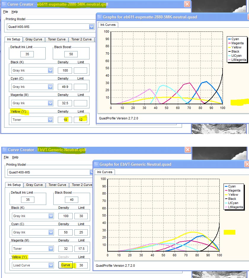
It looks like the toner is working and the ink limit is varying the amount of toner. Look at the Lab B values. Particularly in the lighter part of the test strips. Probably the reason the shadow values did not change much is that there is way less toner per carbon particle in the shadows with the generic QTR "toner" curve set up the way you have it. If you can do a "show curves" in your system, you'll see that the amount of toner is relatively flat with your settings.
I've posted a comparison of your profile's "show curves" compared to the "generic" neutral curve I manually drew for the 1400 EbVT. See
http://www.paulroark.com/BW-Info/Toner-curves-4-3-16.jpg . (The 1400 EbVT used the 90% dilution. For the 75% divide the ink limit by 2.5.) You can move the peak of the QTR "toner" cures right or left by altering the "density" value. I just make them manually for a better fit. You might just want to copy the values out of my curve as a starting point.
My manual curve uses the following coordinates: 0;0 10;4.7 20;13 30;22 40;31 50;46 60;61 70;85 75;91 80;89 85;81 90;61 95;35 100;0
(I'm not sure how this will display on the forum.)
Hope this helps.
Paul
Show quoted textHide quoted text
On Sun, Apr 3, 2016 at 10:35 AM,
andrey@... [DigitalBlackandWhiteThePrint]
<DigitalBlackandWhiteThePrint@yahoogroups.com> wrote:
Paul R or anyone else who knows,
How does one determine the neutralizing toner settings in the .qidf file? The main lever I've been pulling is the Y limit, as the TONER_VAL_1 value doesn't seem to have much effect. I'm trying to neutralize the 5-shade Eboni 1.1 on Epson Ultra Premium Presentation Paper Matte (because it's cheap, and a good way to get the workflow down before moving to more expensive paper), and the Lab b swings are kind of big and not easily controlled when I change the Y limit. Also, I set some value, and then I print a stepwedge to see how it does. Is there a more deterministic way to do this?
From looking through the archives, it seems like changing the limit is the main way people deal with the toner.
Here's a link to 3 different measurements, all text output from the QTR-Linearize-Data app, as well as the. qidf file. All of these files are not linearized. The toner mix is the 75% dilution of the Canon blue and cyan inks at Paul's ratios.
Thanks in advance for any help!
--Andre
2016-04-04 by richard@...
A quick note about what the "density" setting does in the curve creator mode. That is the setting for the cross over point for partitioning the toner between two or more different inks. If you are only using one ink It might move the peak of that channel one way or the other, but unless it has a setting of 100 it will never be printed at the far right of the scale (the 100% density). A better option might be setting the "density" to 100, and use the toner highlight and toner shadow settings to affect how much toner is being applied in the lighter/darker end of the scale. You could also use the toner gamma or toner curve settings in addition to the toner highlight/toner shadow settings to have even more control over how it is being applied (leaving the toner highlight and shadow setting to "0" will create a straight line from 0%-100% of whatever the ink limit is).
Using the ink curve (rather than toner curve) would bypass the toner settings and allow you to distribute the toner ink the way paul is doing in his second example.
I have been thinking about how to work on a way to use a kind of interpolated inverse correction curve for the toner curves that take into account the color and density of the gray inks and the paper base to create an even a and b distribution. The trouble is the density of the toner ink would affect the linearization and then the color would shift again once linearized.... constantly moving targets.
—Richard Boutwell
2016-04-04 by paulmwhiting@...
Richard,
You'll be happy to know that I finally got that script to work in PSElements. It's a long story but for one thing I didn't need to have the script in any particular folder... I could call it up from outside PSE. Secondly, I was using a printout of the 21 step file in the QTR folder, but somehow the script expects the 21 step file that accompanies the script.
Anyway, it works like a charm, thanks so much for reminding of that tool. Like I say, I tried it once a year or two ago but got stuck. This time the good people over at
http://www.photoshopelementsandmore.com/ helped me out (good people here, too, I don't mean to imply othewise!).
Thanks to all,
Paul W.
2016-04-04 by andrey@...
Ah, thanks Paul! Yes, it is indeed flat (as it shows in your graph), and I was wondering how to bump up certain areas to compensate for the increased b values there. Is the curve creator a Windows-only program? I'm on a Mac.
BTW, QTR curveview also shows the sum of all the inks as a black curve. The only other thing I did was to make sure that black curve doesn't touch the top of the graph until the 100% density point. Should this be a concern? I was thinking that the black curve represents the ink load of the paper and I shouldn't exceed the maximum capacity of the paper.
--Andre
2016-04-04 by andrey@...
Thanks Richard! That's certainly many more levers for me to pull on. :) I assume that QTR's curveview will be a good way to visualize these curve changes without committing ink to paper?
2016-04-04 by Paul Roark
Andre,
Curve Creator is for Windows only (currently).
The Windows versions do not, however, show the cumulative ink load. As a practical matter, however, I have never found the toner on top of a gray partition to cause overloading.
Paul
2016-04-05 by andrey@...
So I finally understood what Paul R. and Richard were talking about in their helpful posts yesterday: treat the toner as another ink channel instead of QTR's special toner type.
It turns out that in the .qidf file, as Paul's example generic-neutral file shows, you just have to specify a CURVE_Y and QTR will use the yellow channel! I hadn't changed anything else, nor specified the Y channel in anything other than the limit parameter, and as soon as I added CURVE_Y, it showed up in QTR's curveview.
Using the ink as a normal ink rather than a toner gives you more flexibility to shape the curve. I don't know why, but when I put the curve into TONER_CURVE, the curve will have extra dips in it. Maybe it's wrapped around? I don't know.
So for a first pass, I tried making a curve that was proportional to the b values. That is, the higher the b values, the closer the curve got to its limit value. Well that was a disaster! Lots of negative b values and blue patches. It's probably because the math is more complicated than some kind of linear relationship, and I need to do it based on the density instead. It's not a scaling thing either, ie. too much blue was added but the proportion needed was right, as I tested that with some kind of simple scaling factor.
I wonder if I printed a yellow channel step wedge (which would be blue), whether I could use that to compute the amounts I'd need to add to make the greys neutral. Hmmm ....
Anyway, too much thinking so I just used Paul's generic curve, and I'll be tweaking it by hand for now. Even the limit=8 toner curve is OK for now.
--Andre
2016-04-05 by Paul Roark
To refine the curve, I'd recommend using a neutralized carbon, full profile on your favorite paper. The interactions of the various elements is so non-linear that sampling and an iterative process that includes the entire workflow gets you close enough way faster than trying to decode each step.
Once you have a good neutralized profile (based on a good carbon core, hopefully) you can use the QTR sliders to blend the end points and achieve all the intermediate tones as well as lots of permutations of split toning, and that gets you straight into an area of the printing art that ABW can't reach.
Paul
Paul
Show quoted textHide quoted text
On Tue, Apr 5, 2016 at 11:22 AM,
andrey@... [DigitalBlackandWhiteThePrint]
<DigitalBlackandWhiteThePrint@yahoogroups.com> wrote:
So I finally understood what Paul R. and Richard were talking about in their helpful posts yesterday: treat the toner as another ink channel instead of QTR's special toner type.
It turns out that in the .qidf file, as Paul's example generic-neutral file shows, you just have to specify a CURVE_Y and QTR will use the yellow channel! I hadn't changed anything else, nor specified the Y channel in anything other than the limit parameter, and as soon as I added CURVE_Y, it showed up in QTR's curveview.
Using the ink as a normal ink rather than a toner gives you more flexibility to shape the curve. I don't know why, but when I put the curve into TONER_CURVE, the curve will have extra dips in it. Maybe it's wrapped around? I don't know.
So for a first pass, I tried making a curve that was proportional to the b values. That is, the higher the b values, the closer the curve got to its limit value. Well that was a disaster! Lots of negative b values and blue patches. It's probably because the math is more complicated than some kind of linear relationship, and I need to do it based on the density instead. It's not a scaling thing either, ie. too much blue was added but the proportion needed was right, as I tested that with some kind of simple scaling factor.
I wonder if I printed a yellow channel step wedge (which would be blue), whether I could use that to compute the amounts I'd need to add to make the greys neutral. Hmmm ....
Anyway, too much thinking so I just used Paul's generic curve, and I'll be tweaking it by hand for now. Even the limit=8 toner curve is OK for now.
--Andre
2016-04-06 by andrey@...
I tried the EbVT-generic-neutral curve on some Canson Rag Photographique 310gms last night with the Y limit set to 12 because of the 75% dilution ratio, and the Lab b values are mostly all less than 1, with the darkest tones in the mid to high 1s. The only thing I'll try to tweak is to get the 75% tone, which is around 1.7, below 1. The 90-100% tones can remain slightly warm for my tastes.
On a slightly warmer paper like the Epson Ultra Premium Presentation Paper Matte, the Lab b values are higher and in the mid 2s. But raising the limit to 15 got most of them down well below 2.
Thanks again for all your help!
--Andre
2016-04-15 by rdeloe1@...
Can Paul's Eboni Variable Tone curves work out of the box, without even linearizing? Conventional wisdom says "no". I had a chance to test that recently.
I set up a new Epson Stylus Pro 3880 this week, so I had a chance to try Paul's EbVT curves for the 3880. I have a supply of Premier Art Smooth Fine Art 325, and one of the curve's Paul has provided is for this paper: EbVT-PremierArt-Smooth-HP-325-Neutral-smoothest
The ink I used is a fresh batch, starting with WJ1082 from STS. I mixed up the C6b base from scratch. Importantly, I weighed all the elements rather than mixing by volume. I think weighing is important for precision and reproducability -- plus Paul's curves are based on weighing.
The
two images I routinely use to test curves are (1) Keith Cooper's black and
white test print, and (2) Inkjetmall's Piezography test. I've used them so
many times that I can tell right away if things are working properly.
The one from Inkjetmall is particularly unforgiving in the blacks.
The
"out of the box" results are remarkable given that I didn't linearized them. 100% black
is easily distinguished by eye from 99% black. Most people could be happy with
these results and not have to linearize. I also tried the curve with my own linearization, and Paul's works better.
QTR has a very steep learning curve. I like that there's an option for people starting out that will allow them to get to good prints with minimal fuss. Of course there are only a few paper choices in the ZIP file Paul supplies, and he doesn't have a 3880 anymore to make more. But if you use those papers you can dive right into printing with this setup.